UI Components
TabView
UI component for grouping content into tabs and let users switch between them.
<TabView> is a UI component that shows content grouped into tabs and lets users switch between them.
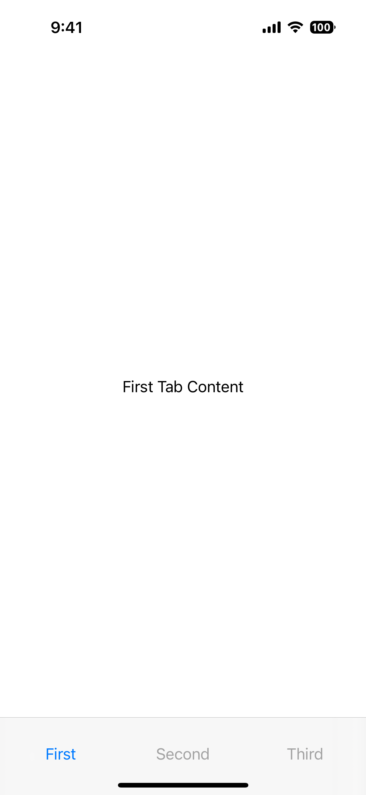
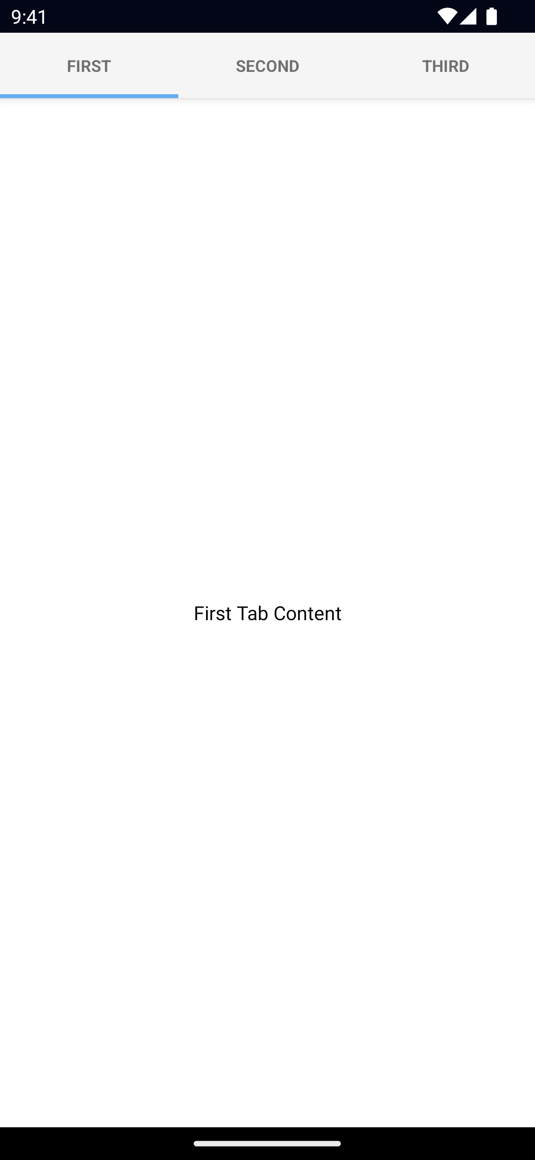
<TabView>
  <TabViewItem title="First">
    <Label text="First Tab Content" textAlignment="center" verticalAlignment="center" />
  </TabViewItem>
  <TabViewItem title="Second">
    <Label text="Second Tab Content" textAlignment="center" verticalAlignment="center" />
  </TabViewItem>
  <TabViewItem title="Third">
    <Label text="Third Tab Content" textAlignment="center" verticalAlignment="center" />
  </TabViewItem>
</TabView>
Props
selectedIndex
selectedIndex: numberGets or sets the currently selected tab.
Defaults to 0.
tabTextColor
tabTextColor: ColorGets or sets the text color of the tab titles.
Corresponding CSS property:
.tab-view {
  tab-text-color: #fff;
}
See Color.
tabTextFontSize
tabTextFontSize: numberGets or sets the font size of the tab titles.
Corresponding CSS property:
.tab-view {
  tab-text-font-size: 24;
}
tabBackgroundColor
tabBackgroundColor: ColorSets the background color of the tabs.
Corresponding CSS property:
.tab-view {
  tab-background-color: #3d5a80;
}
See Color.
androidSelectedTabHighlightColor
androidSelectedTabHighlightColor: ColorSets the underline color of the tabs. Android only.
Corresponding CSS property:
.tab-view {
   android-selected-tab-highlight-color:: #3d5a80;
}
See Color.
androidTabsPosition
androidTabsPosition: 'top' | 'bottom'Sets the position of the tabs. Android only.
Defaults to top.
iosIconRenderingMode
iosIconRenderingMode: 'automatic' | 'alwaysOriginal' | 'alwaysTemplate'Gets or sets the icon rendering mode on iOS. iOS only.
Defaults to automatic.
...Inherited
For additional inherited properties, refer to the API Reference.
TabViewItem Props
title
title: stringGets or sets the title of the tab strip entry.
textTransform
textTransform: TextTransformType // "initial" | "none" | "capitalize" | "uppercase" | "lowercase"Gets or sets the text transform.
See TextTransformType.
Defaults to initial.
iconSource
iconSource: stringGets or sets the icon source of the tab strip entry.
Supported paths are res://, font:// or an absolute path (eg. ~/assets/image.png).
See Image for details on the different paths.
Events
selectedIndexChange
on('selectedIndexChanged', (args: EventData) => {
  const tabView = args.object as TabView
  console.log('TabView selectedIndex:', tabView.selectedIndex)
})
Emitted when the selected tab changes.
Native component
- Android:
androidx.viewpager.widget.ViewPager - iOS:
UITabBarController

